Business As Usual, Inc. Book Covers
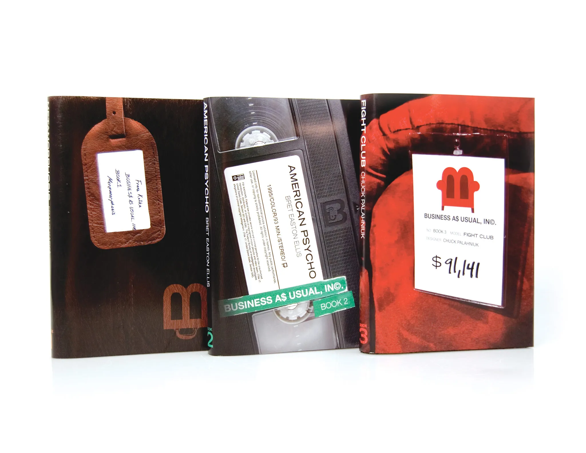
Dust jackets and packaging for a series of three books linked by a common theme.

The Challenge
The Execution
After some research, I realized that all three stories rely heavily on objects as metaphors and plot devices. In Fight Club, the narrator’s obsession with apartment furnishings help us understand his troubling relationship with wealth, and Patrick Bateman always has a tape to return when his murder attempts fail. Based on this, I focused on one physical object to act as the visual element for each book.
The Result
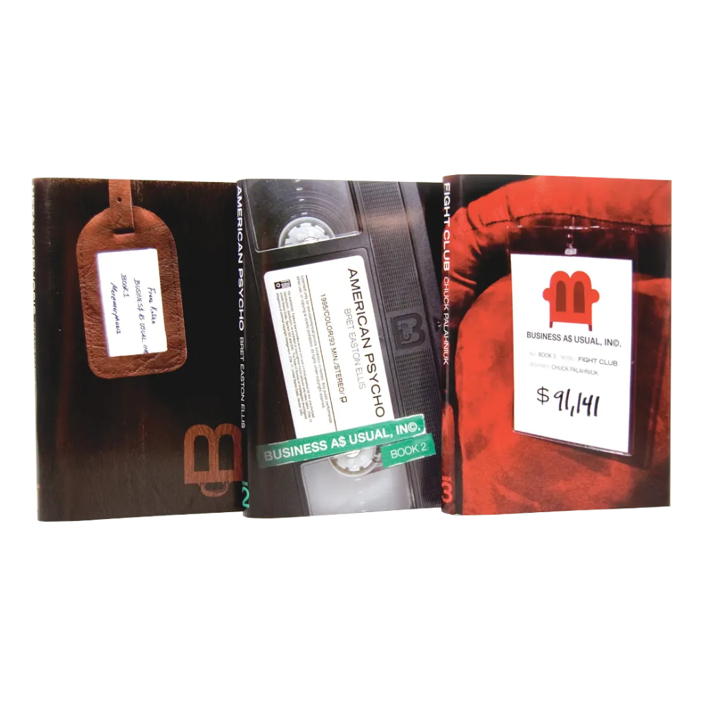
These objects—a briefcase, a VHS tape, and a sofa—help both to differentiate the books visually and to provide plot hints. A special logo was developed for each image based on a consistent “B” letterform to suggest unity between them. Additionally, each cover displays the author and title on a label or tag. The back of each book foreshadows its conclusion, which is complemented by nooses and neckties on the packaging.
